Main Investigators
Bahador Saket
Stephen Kobourov
Sponsors National Science Foundation
-
Publications
- InfoVis 2014 GD 2014
- EuroVis 2014 EuroVis 2015
- EuroVis 2015 EuroVis 2016
Status Completed
Today, anyone on the Internet has access to much of humankind’s collective knowledge and expertise. While this grand flow of information provides a plethora of opportunities, it can also be an overwhelming deluge making it urgent that we answer the question of how best to amplify human perception and cognition to navigate, manage, and make sense of this ever-expanding, advancing knowledge. For decades, Node-link visualizations have been employed as visual interfaces to relational datasets. Node-link visualizations date back to the 18th century and the “seven bridges of Konigsberg” problem, modeled by L. Euler with nodes (for the different parts of the city) and links (for the bridges between them). However, traditional node-link visualizations often fail to capture the underlying structural information, clustering, and neighborhoods. In response, we propose GMap, a technique for visualizing relational datasets as maps. GMap, provides a way to overcome some of the shortcomings with the help of the geographic map metaphor. While graphs, charts, and tables often require considerable effort to comprehend, a map representation is more intuitive, as most people are very familiar with maps and even enjoy carefully examining maps. For instance, Fig. 1 shows a map of all major sciences (color coded and large labels) and 554 subdisciplines (smaller labels) with a zoom into computer science. In this project, we introduced task taxonomies and frameworks for assessing GMap visualizations. We conducted a series of studies to investigate the effectiveness of GMaps from various aspects such as memorability, usability, and engagement.
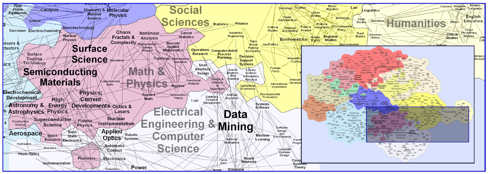
Figure 1: The UCSD map of science visualized with GMap.